As many of us know, when SOLIDWORKS 2016 was released late last year, there was a big change in the user interface. Some icons were updated to give them a cleaner, more professional look and, more obviously, the color scheme of the user interface was changed from predominantly yellow and green to blue and gray. It’s important to note the reasons that these changes were made in the first place which includes the need to support high-resolution monitors and the modernization of the user interface in general. While these changes were welcomed by many, there have been many users clamoring for the return of the old green and yellow color scheme that they have grown to love over the years.
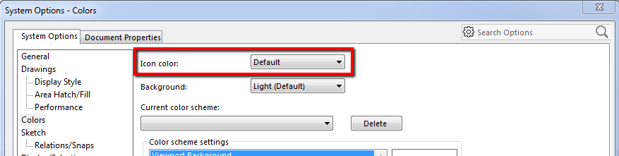
Since the release of SOLIDWORKS 2016, one of the most popular enhancement requests put forth by users has been to give the option to return to this classic color scheme. SOLIDWORKS has listened to the appeals of the masses and in Service Pack 3 has introduced the addition of an “Icon color” setting in System Options. To activate the classic icon colors go to Tools > Options > System Options > Colors, in this window, there is a drop-down box with the option to change this setting.
|
|
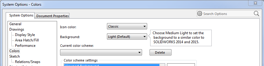
When Classis is selected, a pop-up message lets us know that the background should be set to Medium Light to mimic the user interface from previous versions.
 |
Once these changes have been made the results are obvious.
Before:
 |
After:
 |
These are fairly major changes that will be very pleasing to users who have been apprehensive about upgrading to SOLIDWORKS 2016 due to the change in the user interface. You may notice that not every icon changes with the Classic setting, but there are enough changes that it has a familiar look and feel for those who have been using the previous version of the software. The classic coloring is applied to the most frequent and visible modeling features which include, solid features, surfaces, sheet metal, weldments, and mold tools.
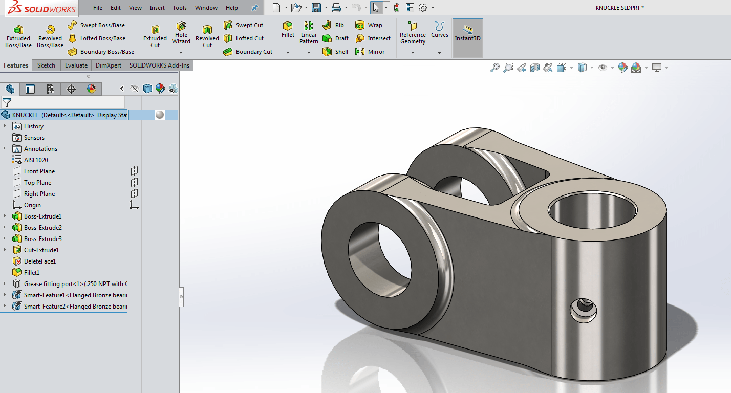
As for those of us who have already become accustomed to the new UI, there are also a few minor changes that have been made to make the Feature Manager Design Tree more appealing.
Some of these changes include:
- Blue part icons, changed from gray.
- Hidden components, bodies, and features like sketches, reference geometry, etc. use “wireframe” icons, with black text (like in 2015 and earlier). The slash () is gone.
- Suppressed items remain grayed out, with gray
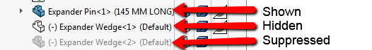
Some of these changes can be seen in the images below.
Before SP3:
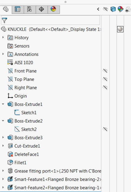 |
After SP3:
 |
Differences between shown, hidden and suppressed parts in an assembly.
 |
These updates reflect a great example of how SOLIDWORKS listens to its users by implementing changes that have been proposed using enhancement requests while at the same time continually improving the program to make it better for future users. For more tutorials, visit our YouTube channel or contact us today!